

In the digital landscape, call to action (CTA) buttons serve as pivotal elements that guide users toward desired actions. Whether operating an e-commerce site, blog, or service-based platform, these buttons are essential for converting visitors into customers or leads. A well-placed CTA can significantly enhance user engagement and drive conversions.
By clearly indicating the desired user action—such as signing up for a newsletter, making a purchase, or downloading a resource—CTAs create a roadmap for the visitor’s journey through the site. The effectiveness of CTA buttons directly impacts business outcomes. When designed thoughtfully, they lead to increased click-through rates and higher conversion rates.
Even minor adjustments in wording, color, or placement can produce substantial results. Understanding the importance of CTAs extends beyond aesthetics; they function as strategic tools that influence user behavior and drive success for online initiatives.
Key Takeaways
- Effective call to action (CTA) buttons leverage psychological principles to boost user engagement and conversions.
- Color, size, shape, and visual cues significantly influence users’ likelihood to click on CTA buttons.
- Clear, persuasive language and creating urgency or FOMO can enhance the click-worthiness of CTAs.
- Trust-building elements and understanding user intent are crucial for designing ethical and effective CTA buttons.
- A/B testing is essential to optimize CTA design by analyzing user behavior and psychological responses.
The Role of Psychology in Designing Call to Action Buttons
Psychology plays a crucial role in the design and effectiveness of call to action buttons. As you delve into the intricacies of user behavior, you’ll discover that understanding psychological triggers can help you craft CTAs that resonate with your audience. For instance, the principle of reciprocity suggests that when you offer something valuable—like a free trial or an informative eBook—users feel compelled to return the favor by taking action, such as signing up or making a purchase.
By incorporating this principle into your CTA design, you can create buttons that not only attract attention but also encourage users to engage. Additionally, the concept of social proof can be leveraged in your CTA strategy. When users see that others have taken action—whether through testimonials, reviews, or user counts—they are more likely to follow suit.
You might consider incorporating elements of social proof into your CTAs, such as “Join 10,000 satisfied customers” or “See why others love our service.” By tapping into these psychological principles, you can enhance the effectiveness of your CTAs and foster a deeper connection with your audience.
Color Psychology and Call to Action Buttons


Color psychology is another vital aspect to consider when designing call to action buttons. The colors you choose can evoke specific emotions and influence user behavior in profound ways. For example, red is often associated with urgency and excitement, making it an excellent choice for CTAs that aim to prompt immediate action.
On the other hand, blue conveys trust and reliability, which can be beneficial for CTAs related to subscriptions or sign-ups. As you select colors for your buttons, think about the emotions you want to evoke and how those colors align with your brand identity.
Furthermore, contrasting colors can make your CTA buttons stand out on the page.
If your website has a predominantly neutral color scheme, a bright orange or green button can draw the eye and encourage clicks. You may want to experiment with different color combinations to see which ones resonate best with your audience. Remember that color perception can vary across cultures and demographics, so it’s essential to consider your target audience when making these decisions.
The Impact of Button Size and Shape on User Behavior
The size and shape of your call to action buttons can significantly influence user behavior as well. Larger buttons tend to attract more attention and are easier to click on mobile devices, where screen space is limited. You might find that increasing the size of your CTA buttons leads to higher click-through rates, especially if they are prominently placed within the layout of your website.
However, it’s essential to strike a balance; overly large buttons can appear aggressive or spammy, potentially deterring users instead of encouraging them. Shape also plays a role in how users perceive and interact with your buttons. Rounded corners often convey friendliness and approachability, while sharp edges may suggest professionalism and seriousness.
Depending on the tone of your brand and the action you want users to take, you can experiment with different shapes to see which resonates best with your audience. Ultimately, both size and shape should work together harmoniously to create an inviting and effective call to action.
The Influence of Text and Language on Click-Worthiness
| Psychological Principle | Description | Impact on CTA Click Rate | Example |
|---|---|---|---|
| Color Psychology | Colors evoke emotions and influence behavior; e.g., red creates urgency, blue builds trust. | Using contrasting colors can increase clicks by up to 21% | Red “Buy Now” button on a white background |
| Urgency & Scarcity | Creating a sense of limited time or availability motivates immediate action. | Adding urgency phrases can boost clicks by 14-30% | “Limited time offer – Act Now!” |
| Action-Oriented Text | Using strong verbs and clear instructions encourages users to take action. | Buttons with verbs like “Get,” “Download,” or “Start” see 10-15% higher engagement | “Download Your Free Guide” |
| Button Size & Shape | Larger buttons with rounded edges are perceived as more clickable and friendly. | Optimized size and shape can increase clicks by 8-12% | Large rounded rectangle button |
| Placement & Surrounding Space | Positioning CTAs above the fold and with ample whitespace draws attention. | Proper placement can improve click rates by 20% | Centered button with padding around it |
| Social Proof | Showing testimonials or user counts builds trust and reduces hesitation. | Including social proof near CTAs can increase clicks by 15% | “Join 10,000+ happy customers” |
The text and language used in your call to action buttons are critical components that can determine their click-worthiness. You want to use clear, concise language that communicates the value of taking action. Phrases like “Get Started,” “Download Now,” or “Claim Your Free Trial” are direct and compelling, encouraging users to engage without ambiguity.
As you craft your CTA text, consider what motivates your audience and how you can articulate that motivation succinctly. Additionally, using action-oriented verbs can create a sense of immediacy and excitement around your CTAs. Instead of passive phrases like “Learn More,” opt for more dynamic alternatives such as “Discover Your Potential” or “Unlock Exclusive Content.” The language you choose should align with the overall tone of your brand while also appealing to the emotions and desires of your target audience.
By carefully selecting your words, you can enhance the effectiveness of your CTAs and drive more clicks.
The Power of Visual Cues in Call to Action Buttons
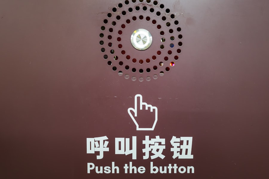

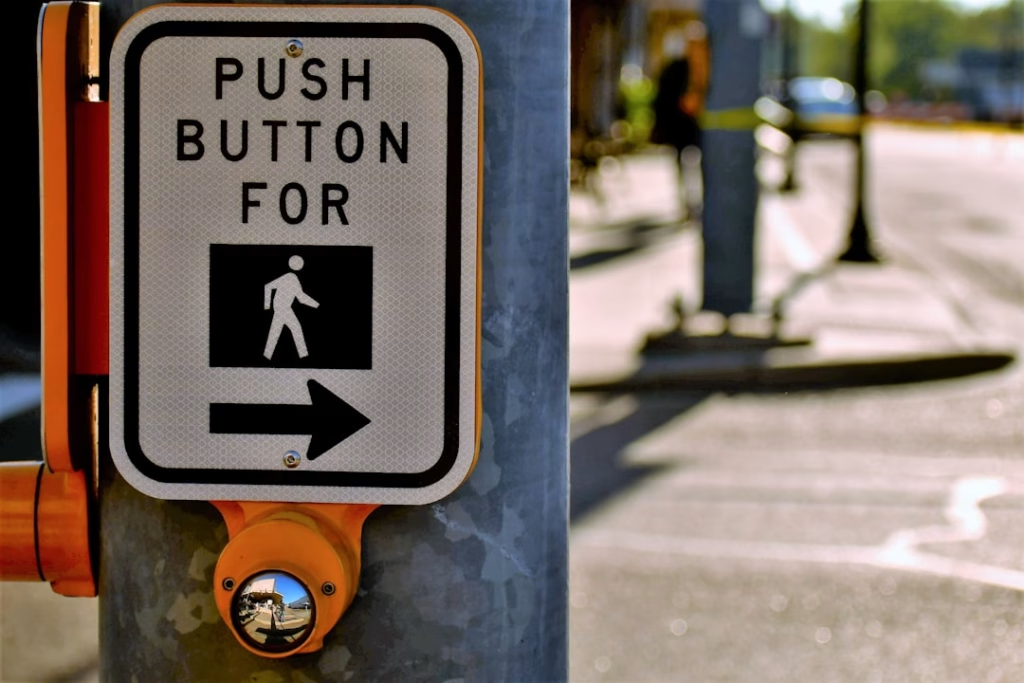
Visual cues play a significant role in guiding users toward call to action buttons. You may have noticed that certain design elements—such as arrows, icons, or images—can draw attention to CTAs and encourage interaction. For instance, an arrow pointing toward a button can create a visual pathway that directs users’ eyes where you want them to go.
Incorporating these cues into your design can enhance usability and make it easier for users to identify the actions you want them to take. Moreover, using images or icons alongside your CTAs can provide additional context and reinforce the message you’re trying to convey. For example, a shopping cart icon next to a “Buy Now” button immediately communicates the action associated with that button.
As you design your CTAs, think about how visual cues can complement your text and overall layout, creating a cohesive experience that guides users seamlessly toward conversion.
Creating a Sense of Urgency and FOMO with Call to Action Buttons
Creating a sense of urgency is a powerful tactic when it comes to call to action buttons. You may have encountered phrases like “Limited Time Offer” or “Only 5 Left in Stock” that prompt immediate action from users. By instilling a fear of missing out (FOMO), you encourage visitors to act quickly rather than delaying their decision.
This psychological trigger can be particularly effective in driving conversions for time-sensitive promotions or limited availability products. To effectively create urgency through your CTAs, consider incorporating countdown timers or highlighting deadlines within the button text itself. For example, “Sign Up Before Midnight!” not only conveys urgency but also provides a clear timeframe for action.
However, it’s essential to use this tactic ethically; misleading claims about scarcity or urgency can damage trust with your audience over time. Striking the right balance between urgency and authenticity is key to maintaining credibility while driving conversions.
The Psychology of Trust and Call to Action Buttons
Trust is a fundamental element in user decision-making processes, especially when it comes to online interactions. Your call to action buttons should reflect an understanding of this psychological principle by instilling confidence in users as they consider taking action. You might achieve this by incorporating elements such as security badges, customer testimonials, or guarantees alongside your CTAs.
These elements serve as social proof that reinforces trustworthiness and encourages users to engage without hesitation. Additionally, using reassuring language in your CTA text can further enhance feelings of trust. Phrases like “Risk-Free Trial” or “Satisfaction Guaranteed” communicate that users have nothing to lose by clicking on your button.
As you design your CTAs, think about how you can build trust through both visual elements and language choices, creating an environment where users feel comfortable taking the next step.
Understanding User Intent and Call to Action Buttons
Understanding user intent is crucial when designing effective call to action buttons. You need to consider what motivates users at different stages of their journey—whether they are just browsing for information or ready to make a purchase decision. Tailoring your CTAs based on user intent allows you to provide relevant options that resonate with their needs at any given moment.
For instance, if users are in the research phase, offering CTAs like “Download Our Free Guide” or “Subscribe for Expert Tips” may be more appropriate than pushing for immediate sales.
Conversely, if users are already engaged with your product offerings, CTAs like “Buy Now” or “Add to Cart” will likely be more effective. By aligning your CTAs with user intent, you create a more personalized experience that encourages engagement and drives conversions.
A/B Testing and the Psychology of Click-Worthy Call to Action Buttons
A/B testing is an invaluable tool for optimizing call to action buttons based on psychological principles and user behavior insights. By testing different variations of your CTAs—such as wording, color schemes, sizes, or placements—you can gather data on what resonates most with your audience. This iterative process allows you to refine your approach continually and make data-driven decisions that enhance click-through rates.
When conducting A/B tests on CTAs, it’s essential to focus on one variable at a time for accurate results. For example, if you’re testing button color, keep everything else constant while observing how changes impact user behavior. Over time, these insights will help you understand which psychological triggers are most effective for your specific audience, allowing you to create click-worthy CTAs that drive meaningful engagement.
Ethical Considerations in Designing Call to Action Buttons
While crafting compelling call to action buttons is essential for driving conversions, ethical considerations must also be at the forefront of your design process. It’s crucial to avoid manipulative tactics that could mislead users or create negative experiences. For instance, using deceptive language or creating false urgency can erode trust and damage relationships with your audience over time.
Instead, focus on transparency and authenticity in your CTA design. Clearly communicate what users can expect when they click on a button—whether it’s signing up for a newsletter or making a purchase—and ensure that any claims made are truthful and substantiated. By prioritizing ethical considerations in your CTA strategy, you not only foster trust but also build long-term relationships with users who appreciate honesty in their online interactions.
In conclusion, call to action buttons are more than just design elements; they are powerful tools that influence user behavior through psychological principles and strategic design choices. By understanding the importance of CTAs and leveraging insights from psychology—such as color choices, language use, visual cues, urgency creation, trust-building strategies, user intent alignment, A/B testing methodologies, and ethical considerations—you can create effective CTAs that drive engagement and conversions while fostering positive relationships with your audience.
Understanding the psychology behind call-to-action buttons is crucial for enhancing user engagement and conversion rates. For those interested in further exploring the effectiveness of email marketing strategies, the article on unlocking your content’s value: the click-to-open rate (CTOR) provides valuable insights into how content quality and presentation can significantly impact user interaction. By combining these insights with effective call-to-action designs, marketers can create more compelling campaigns that drive results.
FAQs
What is a call to action (CTA) button?
A call to action (CTA) button is a clickable element on a webpage or app designed to prompt users to take a specific action, such as “Buy Now,” “Sign Up,” or “Learn More.”
Why is psychology important in designing CTA buttons?
Psychology helps designers understand user behavior, motivation, and decision-making processes, enabling them to create CTA buttons that effectively capture attention and encourage clicks.
What psychological principles influence the effectiveness of CTA buttons?
Key principles include color psychology, urgency, social proof, clarity, contrast, and the use of action-oriented language that appeals to users’ emotions and cognitive biases.
How does color affect the click rate of CTA buttons?
Colors can evoke specific emotions and reactions; for example, red can create a sense of urgency, while green is associated with safety and positivity. The choice of color should align with the brand and the desired user response.
What role does button placement play in user engagement?
Placement affects visibility and accessibility. CTA buttons placed above the fold or near relevant content tend to receive more clicks because they are easier for users to find and interact with.
How does the wording on a CTA button impact user behavior?
Clear, concise, and action-oriented wording that communicates the benefit or next step encourages users to click. Phrases like “Get Started” or “Download Now” are more effective than vague terms.
Can the size and shape of a CTA button influence its effectiveness?
Yes, larger buttons with rounded edges often attract more attention and are perceived as more clickable, improving the likelihood of user interaction.
What is the importance of creating a sense of urgency in CTA buttons?
Urgency, created through words like “Limited Time” or “Only a Few Left,” can motivate users to act quickly, reducing hesitation and increasing conversion rates.
How does social proof enhance the performance of CTA buttons?
Including elements like testimonials, user counts, or trust badges near CTA buttons can build credibility and trust, making users more likely to click.
Are there any common mistakes to avoid when designing CTA buttons?
Common mistakes include using unclear language, poor color contrast, placing buttons in hard-to-find locations, and overcrowding the page, all of which can reduce click-through rates.