

Mobile Optimization: A Key Element in Email Marketing
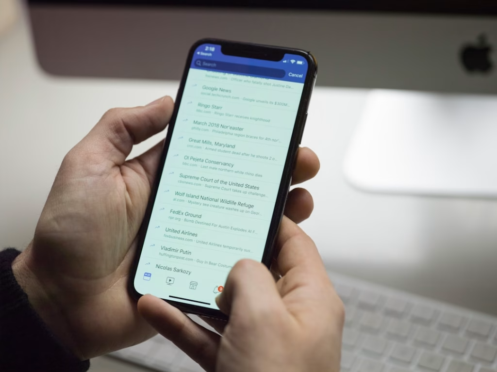
Mobile optimization has become essential for effective email marketing in today’s digital environment. A substantial percentage of users now access emails via smartphones and tablets, making it necessary to ensure emails function properly on smaller screens. Properly optimized mobile emails improve user experience, boost engagement metrics, and help convert recipients into customers.
The implications of mobile optimization go beyond visual presentation. Emails that aren’t mobile-friendly risk alienating a significant portion of your audience. Statistics show that more than 50% of emails are opened on mobile devices.
When recipients encounter content that’s difficult to read or navigate on their mobile devices, they typically delete the email immediately or unsubscribe from future communications. Implementing mobile optimization strategies helps create more effective campaigns that connect with audiences and build sustainable engagement.
Key Takeaways
- Mobile optimization is crucial for effective email marketing and user engagement.
- Design emails with responsive layouts and clear, concise content for small screens.
- Use mobile-friendly fonts, optimized images, and compelling calls-to-action to enhance readability and interaction.
- Test emails across various devices and platforms to ensure consistent performance.
- Personalize content and incorporate interactive elements to boost engagement and analyze results for continuous improvement.
Designing emails for small screens
When it comes to designing emails for small screens, simplicity is key. You want to create a layout that is easy to navigate and visually appealing without overwhelming the recipient. As you craft your email, consider using a single-column format that allows for a seamless reading experience.
This approach not only makes it easier for users to scroll through your content but also ensures that important information is readily accessible without excessive zooming or scrolling. In addition to layout considerations, pay attention to the size and placement of buttons and links. On smaller screens, users may struggle to tap on tiny buttons or links accurately.
Therefore, it’s essential to make these elements larger and more spaced out to facilitate easy interaction. By designing with small screens in mind, you can create an email experience that feels intuitive and user-friendly, ultimately leading to higher engagement rates.
Creating responsive layouts


Creating responsive layouts is an essential aspect of mobile optimization that allows your emails to adapt seamlessly to various screen sizes. As you design your email, consider using fluid grids and flexible images that can resize based on the device being used. This approach ensures that your content remains visually appealing and easy to read, regardless of whether it’s viewed on a smartphone, tablet, or desktop.
Additionally, employing media queries in your email code can help you tailor the design for different devices. By specifying different styles for various screen widths, you can control how elements appear on smaller screens versus larger ones. This level of customization not only enhances the user experience but also reinforces your brand’s professionalism and attention to detail.
A responsive layout is not just a trend; it’s a necessity in today’s multi-device world.
Using clear and concise content
When crafting content for mobile emails, clarity and conciseness should be at the forefront of your mind. Mobile users often skim through their emails rather than reading them in detail, so it’s crucial to get straight to the point. Aim to convey your message in as few words as possible while still maintaining its essence.
This approach not only respects the recipient’s time but also increases the likelihood that they will engage with your content. To enhance clarity, consider using bullet points or numbered lists to break up text and highlight key information. This formatting technique makes it easier for readers to digest your message quickly.
Additionally, using subheadings can help guide users through the content and draw attention to important sections. By prioritizing clear and concise content, you can ensure that your emails resonate with mobile users and encourage them to take action.
Optimizing images for mobile viewing
| Metric | Description | Mobile First Email Impact | Recommended Best Practice |
|---|---|---|---|
| Open Rate | Percentage of recipients who open the email | Mobile optimized emails see up to 30% higher open rates on phones | Use concise subject lines and preheader text optimized for mobile display |
| Click-Through Rate (CTR) | Percentage of recipients who click on links within the email | Mobile-friendly buttons and links increase CTR by 20% | Design large, tappable buttons with adequate spacing |
| Load Time | Time taken for the email to fully load on mobile devices | Faster load times reduce bounce rates by up to 15% | Use optimized images and minimal code for faster loading |
| Readability | Ease of reading content on small screens | Improved readability increases engagement duration by 25% | Use larger fonts (14-16px), single-column layouts, and sufficient line spacing |
| Unsubscribe Rate | Percentage of recipients who opt out after receiving the email | Mobile-first design can reduce unsubscribe rates by 10% | Ensure clear, easy-to-find unsubscribe links and relevant content |
Images play a vital role in email marketing, but they must be optimized for mobile viewing to ensure a positive user experience. Large image files can slow down loading times, leading to frustration for recipients who are trying to access your content on their mobile devices. To avoid this issue, compress your images before including them in your emails.
This process reduces file size without sacrificing quality, allowing for faster loading times and a smoother experience. In addition to compression, consider using responsive images that adjust based on the screen size. By employing HTML attributes like “srcset,” you can specify different image sizes for various devices, ensuring that users receive an appropriately sized image without unnecessary data usage.
Furthermore, always include alt text for images; this not only improves accessibility but also provides context in case images fail to load.
By optimizing images for mobile viewing, you enhance the overall effectiveness of your email campaigns.
Implementing mobile-friendly fonts and text sizes

The choice of fonts and text sizes can significantly impact the readability of your emails on mobile devices. When selecting fonts, opt for web-safe options that are easy to read across different platforms and devices. Sans-serif fonts are often recommended for digital content due to their clean lines and legibility on screens.
Additionally, ensure that your font sizes are large enough for mobile users to read comfortably without zooming in. A good rule of thumb is to use a minimum font size of 14 pixels for body text and slightly larger sizes for headings. This ensures that your content remains accessible and easy to read on smaller screens.
Furthermore, pay attention to line spacing and paragraph length; shorter paragraphs with ample spacing can improve readability and keep users engaged with your content.
By implementing mobile-friendly fonts and text sizes, you create an email experience that is both visually appealing and user-centric.
Including a compelling call-to-action
A compelling call-to-action (CTA) is crucial for driving engagement in your mobile emails. As you design your CTA, consider its placement and visibility within the email layout. It should stand out from the rest of the content while still feeling integrated into the overall design.
Use contrasting colors and bold text to draw attention to the CTA button or link, making it clear what action you want the recipient to take. Additionally, keep the wording of your CTA concise and action-oriented. Phrases like “Shop Now,” “Learn More,” or “Get Started” create a sense of urgency and encourage users to click through.
Remember that mobile users may be more likely to engage with CTAs that are easily tappable; therefore, ensure that buttons are large enough for fingers to tap accurately without frustration. By including a compelling call-to-action in your emails, you can effectively guide recipients toward taking the desired action.
Testing emails across different devices and platforms
Before sending out your email campaigns, it’s essential to test them across various devices and platforms to ensure optimal performance. Different email clients may render your design differently, which can lead to inconsistencies in how your content appears to recipients. By conducting thorough testing on popular devices such as iPhones, Android phones, tablets, and desktops, you can identify any issues that may arise.
Utilizing testing tools can streamline this process by allowing you to preview how your email will look across multiple platforms simultaneously. Pay attention not only to visual elements but also functionality; ensure that links work correctly and CTAs are easily accessible. By taking the time to test your emails thoroughly, you can catch potential problems before they reach your audience, ultimately enhancing their experience and increasing engagement.
Personalizing emails for mobile users
Personalization is a powerful tool in email marketing that can significantly enhance user engagement, especially on mobile devices. When crafting personalized emails, consider incorporating dynamic content that speaks directly to the recipient’s preferences or behaviors. For instance, addressing recipients by their first name or tailoring product recommendations based on past purchases can create a more relevant experience.
Additionally, segmenting your audience based on demographics or interests allows you to send targeted messages that resonate with specific groups. Mobile users appreciate content that feels tailored to them; by leveraging personalization techniques, you can foster a deeper connection with your audience and encourage them to interact with your emails more frequently.
Utilizing interactive elements for increased engagement
Incorporating interactive elements into your mobile emails can significantly boost engagement levels among recipients. Features such as polls, surveys, or embedded videos encourage users to interact with your content rather than passively consuming it. These elements not only make your emails more engaging but also provide valuable insights into user preferences and behaviors.
When implementing interactive features, ensure they are optimized for mobile use; this means keeping interactions simple and intuitive so that users can easily participate without frustration. For example, using tappable buttons for polls or quizzes allows recipients to engage quickly without navigating away from their inboxes. By utilizing interactive elements effectively, you can create a more dynamic email experience that captures attention and drives engagement.
Analyzing and optimizing email performance for mobile devices
Once you’ve implemented various strategies for mobile optimization in your email campaigns, it’s crucial to analyze their performance continually. Monitoring key metrics such as open rates, click-through rates (CTR), and conversion rates will provide valuable insights into how well your emails resonate with mobile users. By understanding which elements perform well and which need improvement, you can refine your approach over time.
Utilizing A/B testing can also be beneficial in this process; by experimenting with different subject lines, layouts, or CTAs, you can identify what resonates best with your audience on mobile devices. Additionally, gathering feedback from recipients through surveys or direct responses can provide qualitative insights into their experiences with your emails. By consistently analyzing and optimizing email performance for mobile devices, you position yourself for ongoing success in an ever-evolving digital landscape.
In conclusion, prioritizing mobile optimization in your email marketing strategy is no longer optional; it’s essential for reaching today’s audience effectively. By understanding its importance and implementing best practices across various aspects—from design and content creation to testing and analysis—you can create compelling email campaigns that engage users on their preferred devices. Embrace these strategies as part of your ongoing efforts to connect with your audience meaningfully and drive results in an increasingly mobile-centric world.
Designing mobile-first emails is crucial for achieving higher open rates on phones, as it ensures that your content is optimized for the small screens that most users rely on. For those looking to enhance their email marketing strategies further, you might find valuable insights in the article on maximizing ROI with split testing, which discusses how to effectively test different email designs and content to determine what resonates best with your audience.
FAQs
What does “mobile first” mean in email design?
“Mobile first” in email design refers to creating emails primarily optimized for mobile devices before adapting them for desktop viewing. This approach ensures that emails are easily readable and engaging on smaller screens, which is crucial as a majority of users check emails on their phones.
Why is designing mobile first important for email open rates?
Designing mobile first is important because most email opens occur on smartphones. Emails that are not optimized for mobile can appear cluttered or difficult to read, leading to lower engagement and open rates. Mobile-friendly emails improve user experience, encouraging recipients to open and interact with the content.
What are key elements of a mobile first email design?
Key elements include a single-column layout, larger and legible fonts, touch-friendly buttons, concise content, optimized images for faster loading, and clear calls to action. These features help ensure the email is easy to navigate and visually appealing on small screens.
How can I test if my email is mobile friendly?
You can test mobile friendliness by sending test emails to various devices and email clients, using email testing tools like Litmus or Email on Acid, and previewing your email in responsive design modes. These methods help identify layout issues and ensure consistent rendering across devices.
Does mobile first email design affect desktop viewing?
Mobile first design typically uses responsive techniques that adapt the email layout for larger screens. While the primary focus is on mobile optimization, well-designed mobile first emails also provide a good user experience on desktops by adjusting elements like font size and image placement.
What role do images play in mobile first email design?
Images should be optimized for quick loading and scaled appropriately for small screens. Using responsive images that adjust size based on the device helps maintain visual appeal without slowing down email load times, which is critical for retaining mobile users’ attention.
How can I improve call-to-action (CTA) effectiveness in mobile emails?
To improve CTA effectiveness, use large, easily tappable buttons with clear and concise text. Position CTAs prominently within the email and ensure sufficient spacing around them to prevent accidental clicks, enhancing user interaction on touchscreens.
Are there any common mistakes to avoid in mobile first email design?
Common mistakes include using small fonts, cluttered layouts, tiny buttons, heavy images that slow loading, and neglecting to test emails on multiple devices. Avoiding these pitfalls helps create a seamless and engaging mobile email experience.
How does email subject line length impact mobile open rates?
Shorter subject lines are generally more effective on mobile devices because they display fully on smaller screens, making the message clear and enticing. Keeping subject lines concise can increase the likelihood of recipients opening the email.
Can mobile first email design increase overall email marketing ROI?
Yes, by improving readability, engagement, and user experience on mobile devices, mobile first email design can lead to higher open and click-through rates, ultimately boosting conversions and the return on investment for email marketing campaigns.