

You’re a developer, or perhaps a designer, staring at your meticulously crafted HTML email, the one that took you hours to perfect on your local machine. You’ve tested it in the latest version of Chrome, Firefox, and Safari. It’s beautiful, responsive, and cross-browser compatible – or so you thought. Then you send it out, and chaos erupts. Elements are misaligned, fonts are substituted, images refuse to appear, and your carefully designed call-to-action buttons look like they’re from the dial-up era. Welcome to the wild, wonderful, and often frustrating world of email client HTML rendering.
Forget the polished standards of modern web browsers. Email clients are a different beast entirely. They’re built for a singular purpose: displaying messages, and that purpose has led to a deeply ingrained, often outdated, and frustratingly inconsistent approach to rendering HTML. Think of it less like building a sleek website and more like assembling a jigsaw puzzle with a box of pieces from different centuries. This article is your guide to demystifying this often-opaque process, equipping you with the knowledge and strategies to navigate the treacherous waters of email client rendering and create emails that actually look good for your recipients.
To understand why email clients are so peculiar, you need to delve into their history. The earliest email clients were designed to display plain text messages. As the internet evolved, so did the desire for richer content. The initial attempts to introduce HTML into emails were met with resistance and a patchwork of implementations. This history is the bedrock of the current rendering landscape.
Early Text-Based Communication
In the nascent stages of email, communication was purely textual. Emails were simple, linear streams of characters. The concept of formatting, let alone layout, was foreign. This established a baseline expectation of simplicity for email clients.
The Advent of HTML and Its Early Adoption
When HTML started gaining traction for web pages, the desire to bring some of that visual richness to email was natural. However, the infrastructure and the clients themselves weren’t ready for it. Instead of adopting robust HTML parsing and rendering engines, many email clients adopted rudimentary, often proprietary, methods to interpret HTML. This laid the groundwork for the inconsistencies we face today. Specialized rendering engines were not built, and instead, existing technologies and practices were shoehorned in.
Security Concerns and Sanitization
A significant factor in email client rendering is security. Email clients are constantly battling spam and phishing attempts. Historically, allowing arbitrary HTML and scripting within emails was a major security vulnerability. This led to email clients aggressively sanitizing or outright stripping out certain HTML elements, attributes, and CSS properties they deemed potentially harmful. This sanitization process, while necessary for security, is a major hurdle for designers.
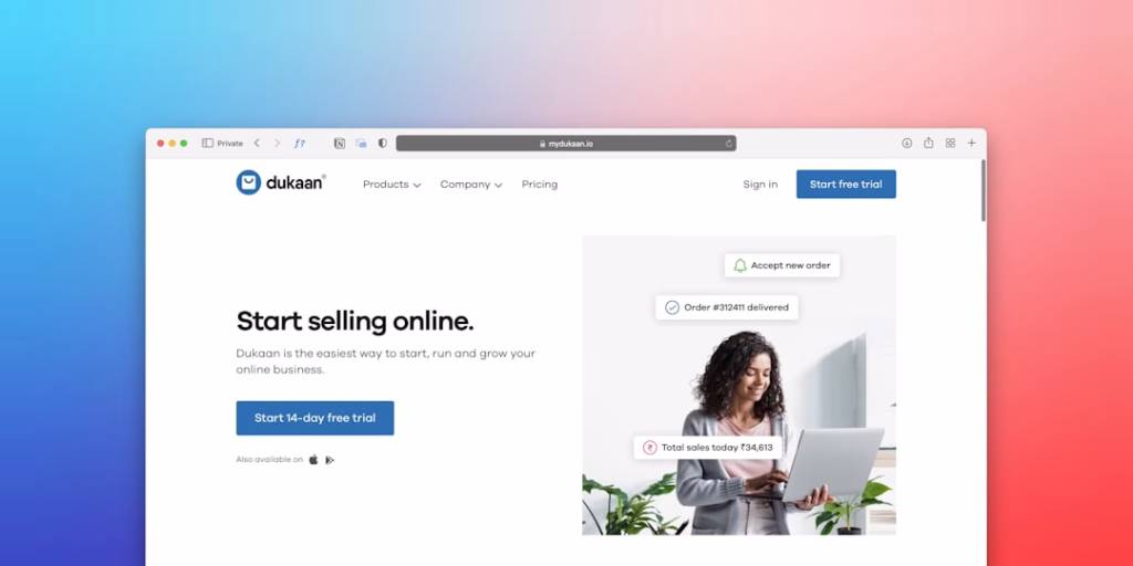
Understanding how email clients render HTML email templates is crucial for effective email marketing. For those looking to enhance their email strategies, you might find the article on unlocking your martech stack particularly useful. It provides insights into leveraging SmartMails’ API key to optimize your email campaigns and improve overall performance. To explore this further, check out the article here: Unlock Your Martech Stack: A Simple Guide to SmartMails API Key.
Understanding the Rendering Engines (The Black Box)
This is where things get truly interesting, and often maddening. Unlike web browsers that generally adhere to well-defined W3C standards, email clients utilize a diverse array of rendering engines, some of which are deeply embedded and not easily updated or modified. This means a single piece of HTML could render perfectly in one client and completely break in another.
Microsoft Outlook’s Peculiarities (The Elephant in the Room)
Microsoft Outlook, in its various desktop versions, has long been the bane of email developers worldwide. Its rendering engine is notorious for its quirks. Older versions of Outlook (pre-2007) notoriously used Microsoft Word’s rendering engine, which explains its obsession with tables and its aversion to modern CSS. Even newer versions, while improving, still maintain a unique interpretation of HTML and CSS.
Outlook.com and Webmail Versions
It’s important to distinguish between desktop Outlook and Outlook.com. While they share some lineage, Outlook.com, being a web-based client, generally follows web standards more closely. However, there can still be subtle differences in how it interprets certain styles compared to a typical web browser.
The “Word Rendering Engine” Legacy
The historical reliance on Microsoft Word’s rendering engine for older desktop Outlook versions has left a lasting impact. This engine’s primary strength lies in document layout, not web-style responsive design. It prioritizes predictable print-like output, which is profoundly different from the fluid, adaptable nature of web pages. This means that many modern CSS techniques that web developers take for granted simply don’t translate well, or at all, to these versions. Developers often have to resort to older, more robust techniques to ensure compatibility.
Versions and Their Rendering Differences
The fragmentation doesn’t stop with just “Outlook.” Different versions of Outlook (e.g., Outlook 2003, 2007, 2010, 2013, 2016, 2019, Microsoft 365) each have their own specific rendering behaviors and bugs. This requires a deep understanding of which versions your audience is likely to use and how to cater to their unique foibles. Testing across as many relevant Outlook versions as possible is crucial.
Gmail’s Approach (The Popular but Opinionated Client)
Gmail, by far the most popular webmail client, has its own distinct rendering characteristics. While generally more standards-compliant than older Outlook versions, Gmail still has some notable quirks and limitations, particularly with CSS.
Webmail Rendering
Gmail’s web interface is built on web technologies, so it generally aligns better with web standards. However, it still applies its own rendering logic, and certain CSS properties might be altered or ignored.
Mobile Gmail App
The Gmail mobile app, while designed for mobile viewing, also has its own set of rendering rules. It often displays emails differently than the web version, and it’s vital to test your emails on both mobile and desktop Gmail interfaces.
Apple Mail and iOS Mail (The Generally Well-Behaved Ones)
Apple Mail, found on macOS and iOS devices, is generally considered one of the more well-behaved email clients. It tends to render HTML and CSS more consistently with web standards, making it a good baseline for testing.
macOS Mail
The desktop version of Apple Mail generally adheres closely to web standards, making it a good platform to aim for when building your emails.
iOS Mail and iPadOS Mail
The mobile versions of Apple Mail are equally robust and offer a good representation of how your emails will look on iPhones and iPads. These clients are often easier to design for than Outlook.
Safari’s Influence
It’s widely accepted that Safari’s WebKit rendering engine heavily influences how Apple Mail renders HTML. This often means that if your email looks good in Safari, it’s likely to look good in Apple Mail as well. This provides a useful proxy for testing.
Other Popular Clients (A Diverse Landscape)
Beyond the big three, there are numerous other email clients, each with its own rendering engine and quirks. These include Yahoo! Mail, AOL Mail, Thunderbird, and various other webmail and desktop applications used by different user bases.
Yahoo! Mail
Yahoo! Mail has its own legacy rendering engine that can be unpredictable. It often requires specific testing to ensure consistent display.
AOL Mail
Similar to Yahoo, AOL Mail has its own unique rendering characteristics that need to be accounted for.
Thunderbird
Mozilla’s Thunderbird, a popular desktop email client, generally follows web standards more closely than older Outlook versions, but still has its own nuances.
The Art of Table-Based Layouts (A Necessary Evil)


For years, the standard practice for structuring HTML emails was to employ table-based layouts. This is not a stylistic choice but a technical necessity dictated by the rendering engines of many email clients, particularly older versions of Outlook. While modern web development has moved away from tables for layout, they remain a cornerstone of robust email design.
Why Tables? The Foundation of Email Layout
Tables, with their predictable cell-based structure, offer a level of control and reliability that is often absent with modern CSS layout techniques like Flexbox or CSS Grid. Email clients have historically been very good at rendering tables consistently.
Rows and Columns as Containers
You can think of HTML tables as a framework of rows and columns that act as containers for your content. This predictable structure allows you to build complex layouts that are less likely to break across different clients.
Cell Padding and Spacing
Tables provide precise control over cell padding and spacing, allowing you to manage the whitespace around your content meticulously. This is crucial for achieving a polished and professional look.
Nesting Tables for Complex Designs
To achieve more intricate layouts, you’ll often need to nest tables within one another. This means a table within a table, allowing you to create sections, columns, and more detailed arrangements of content.
Creating Columns with Tables
A common technique is to use a parent table with a single cell, and then nest child tables within that cell, each representing a column. This is a versatile method for creating side-by-side content blocks.
Structuring Content Blocks
Nesting tables allows you to create distinct content blocks, such as headers, footers, sidebars, and main content areas, each within its own table or nested table structure.
The Limitations of Tables
While essential, table-based layouts also come with their own set of limitations. They can make your HTML more verbose, harder to read, and less semantically appropriate for modern web development.
Verbosity and Readability
Extensive use of nested tables can lead to very long and complex HTML code, making it challenging to understand and maintain.
Semantics and Accessibility Concerns
From a semantic standpoint, using tables for layout can be problematic. Tables are intended for tabular data, not for general page structure. This can potentially impact accessibility for users who rely on screen readers.
CSS in Email: A minefield of Supported and Unsupported Properties

Cascading Style Sheets (CSS) are fundamental to modern web design, but their implementation in email clients is a far cry from the freedom you have on the web. Many CSS properties are either unsupported, inconsistently supported, or will be stripped out by email clients’ sanitization filters.
Inline Styles: Your Best Friend (and Sometimes Worst Enemy)
The most reliable way to apply CSS in email is by using inline styles directly within your HTML elements. Email clients are far more likely to respect styles applied directly to tags.
The style Attribute
Applying styles directly using the style attribute on HTML tags like
, Example: style="color: #ffffff; font-family: Arial, sans-serif; font-size: 14px;"
This simple inline style directly tells the
Internal Stylesheets (Use with Caution)
You can include CSS within a