


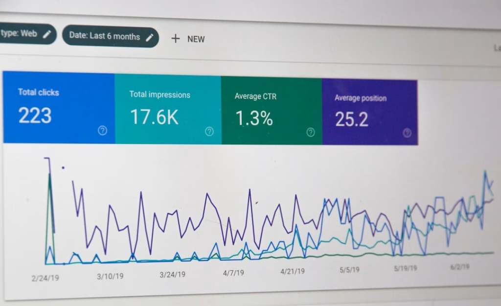
You’re staring at a screen, the data blinking back at you. It’s your first email campaign report, and it feels like a foreign language. Numbers, percentages, charts – they’re all there, but what do they mean for your business? Don’t worry, you’re not alone. Many beginners find email campaign reports daunting. This guide is here to demystify those metrics and help you craft reports that are not just informative, but truly actionable, even for someone just dipping their toes into the world of email marketing.
You’ve put in the effort. You’ve brainstormed compelling subject lines, designed an engaging email, and meticulously segmented your audience. Now comes the crucial post-campaign analysis. This isn’t just about seeing if your email performed well; it’s about understanding why it performed that way and using that knowledge to make your future campaigns even more effective. Think of this report as a conversation with your audience, translated into data. Your job is to understand that conversation and respond intelligently.
Let’s break down the process of crafting beginner-friendly email campaign reports, step by step. We’ll focus on clarity, simplicity, and identifying the key insights that will drive your marketing efforts forward.
Before you even think about pulling data, you need to understand why you’re generating this report. For a beginner, this might seem obvious – to see if the campaign worked. But it’s more nuanced than that. A good report goes beyond a simple “yes” or “no.” It’s about learning and improvement.
Why Report on Email Campaigns?
- Measuring Success: The most straightforward reason is to quantify the success of your campaign against your predefined goals. Did you achieve what you set out to do? This could be anything from driving website traffic to generating sales, increasing sign-ups, or boosting brand awareness. Without measurement, you’re essentially flying blind.
- Identifying What Works (and What Doesn’t): Not every element of your campaign will resonate with your audience equally. Your report helps you pinpoint which subject lines grabbed attention, which calls to action were most effective, which email content led to engagement, and which audience segments responded best. This insight is invaluable for future planning.
- Optimizing Future Campaigns: This is arguably the most important aspect for a beginner. The data from your current report is your roadmap for improvement. By understanding past performance, you can make informed decisions about your next campaign’s strategy, content, targeting, and timing. It’s a continuous learning loop.
- Demonstrating ROI (Return on Investment): As you become more comfortable, you’ll want to understand the financial impact of your email marketing. Even at a basic level, understanding how many leads or sales your campaign generated directly contributes to demonstrating its value to your business or stakeholders.
- Learning About Your Audience: Each email campaign is a mini-experiment in understanding your audience’s preferences, behaviors, and motivations. Your report is the feedback loop that tells you what resonates with them, what their pain points are, and what drives them to take action.
For those looking to enhance their email marketing strategies, understanding how to create beginner-friendly email campaign reports is crucial. A related article that delves into optimizing your marketing efforts is titled “Maximizing Landing Page Leads with A/B Testing.” This resource provides valuable insights on how to effectively test different landing page elements to improve conversion rates, which can complement your email campaigns. You can read the article here: Maximizing Landing Page Leads with A/B Testing.
Key Metrics Every Beginner Needs to Track
When you’re starting out, the sheer volume of metrics can be overwhelming. Focus on the foundational metrics that provide the most significant insights. These are the building blocks of your understanding.
The Essential Trio: Open Rate, Click-Through Rate, and Conversion Rate
These three metrics are the pillars of basic email campaign performance. They tell a clear story about how your email is being received and acted upon.
Understanding Open Rate
- What it is: The percentage of recipients who opened your email after it was delivered.
- Formula: (Number of unique opens / Number of emails delivered) \* 100
- What it tells you: Primarily, this reflects the effectiveness of your subject line and your sender name. A good open rate means your subject line successfully captured your audience’s attention and made them curious enough to open.
- What to look for:
- Benchmark: Industry averages vary, but generally, a 20-30% open rate is considered decent. However, don’t get too hung up on benchmarks initially. Focus on your own trends.
- Trends: Is your open rate increasing or decreasing over time? This can indicate whether your subject lines are becoming more or less effective.
- Segmentation: Do different segments of your audience have significantly different open rates? This might suggest you need to tailor subject lines for specific groups.
- Factors influencing Open Rate:
- Subject Line: Is it clear, concise, compelling, and relevant?
- Sender Name: Is it recognizable and trustworthy?
- Preview Text: This snippet of text that appears after the subject line can entice opens.
- Send Time: When is your audience most likely to check their email?
- List Health: Are you sending to engaged subscribers?
Understanding Click-Through Rate (CTR)
- What it is: The percentage of recipients who clicked on at least one link within your email after opening it.
- Formula: (Number of unique clicks / Number of emails delivered) \* 100
- Note: Some platforms also measure Click-to-Open Rate (CTOR), which is (Number of unique clicks / Number of unique opens) \ 100. This is also very useful as it shows how many people who opened* your email actually clicked a link.
- What it tells you: This metric is a strong indicator of how engaging and relevant your email content and call to action (CTA) are. A high CTR means your email convinced recipients to take the next step.
- What to look for:
- Benchmark: Again, industry averages exist, but focus on your own journey. A 2-5% CTR is often a starting point.
- Content Effectiveness: Are people clicking on the links in your email? This tells you if your message is compelling enough to warrant further action.
- CTA Clarity: Is your call to action clear, prominent, and easy to understand?
- Factors influencing CTR:
- Call to Action (CTA): Is it strong, clear, and benefit-driven?
- Email Content: Is it relevant, valuable, and persuasive?
- Link Placement: Are your links easy to find and click?
- Design and Formatting: Is the email visually appealing and easy to read?
- Offer: Is the offer or information presented appealing to your audience?
Understanding Conversion Rate
- What it is: The percentage of recipients who completed a desired action after clicking a link in your email. This action is your campaign’s ultimate goal.
- Formula: (Number of conversions / Number of emails delivered) \* 100
- Note: You can also calculate this based on clicks: (Number of conversions / Number of unique clicks) \* 100. This is often referred to as Conversion Rate by Click.
- What it tells you: This is the bottom line. It shows how effectively your email campaign contributed to your business objectives, whether that’s making a sale, signing up for a webinar, downloading a resource, or filling out a form.
- What to look for:
- Goal Achievement: Did you hit your target conversion numbers?
- Impact on Business: How many sales or leads did this email generate?
- Landing Page Performance: If your conversion happens on a landing page, this metric also indirectly reflects how well that page is performing.
- Factors influencing Conversion Rate:
- Clear Value Proposition: Is the benefit of the conversion obvious?
- Seamless User Journey: Is the path from email click to conversion smooth and intuitive?
- Landing Page Optimization: Is the landing page relevant, clear, and easy to use?
- Offer Strength: Is the offer compelling enough to drive action?
- Trust and Credibility: Does the recipient trust your brand enough to convert?
Other Important Metrics to Keep an Eye On
While the trio above is essential, a few other metrics can provide valuable context and deeper insights.
Bounce Rate
- What it is: The percentage of emails that could not be delivered to the recipient’s inbox.
- Types:
- Hard Bounces: Permanent delivery failures (e.g., invalid email address).
- Soft Bounces: Temporary delivery failures (e.g., inbox full, server down).
- What it tells you: A high bounce rate indicates issues with your email list quality. It’s crucial to clean your list regularly to avoid sending to invalid addresses, which can harm your sender reputation.
- What to look for: Aim for a low bounce rate, ideally below 2-5%. High hard bounces signal a need for immediate list cleaning.
Unsubscribe Rate
- What it is: The percentage of recipients who opted out of your email list after receiving your campaign.
- Formula: (Number of unsubscribes / Number of emails delivered) \* 100
- What it tells you: While a small number of unsubscribes is normal and healthy (people’s interests change!), a consistently high rate suggests your content might not be relevant, your sending frequency is too high, or you’re not delivering on the expectations set during sign-up.
- What to look for: A healthy unsubscribe rate is typically below 0.5%. A spike could be a red flag.
Spam Complaints
- What it is: The percentage of recipients who marked your email as spam.
- Formula: (Number of spam complaints / Number of emails delivered) \* 100
- What it tells you: This is one of the most damaging metrics. A high spam complaint rate severely impacts your sender reputation and can lead to your emails being blocked entirely. It means recipients didn’t want to see your email, and that’s a critical issue to address.
- What to look for: Aim for a rate as close to zero as possible. Any increase should be investigated immediately.
Structuring Your Beginner-Friendly Report


Now that you know what to measure, let’s talk about how to present it. The goal here is clarity and conciseness. Avoid jargon and overwhelming charts.
Executive Summary: The “Too Long; Didn’t Read” Version
This is your report’s elevator pitch. It should be a brief overview of the campaign’s performance, key takeaways, and immediate next steps. Imagine you’re explaining the campaign’s success to someone who has only 30 seconds.
Key Highlights and Lowlights
- The Big Picture: Start with a sentence or two summarizing the overall success. Was it a win? A learning experience?
- Top Performing Metrics: Briefly mention the best performing numbers (e.g., “We saw a strong open rate of 25%, exceeding our goal”).
- Areas for Improvement: Briefly touch upon metrics that could have been better (e.g., “Our click-through rate was lower than anticipated, indicating a need to re-evaluate our CTA”).
- Overall Verdict: A simple statement like, “Overall, the campaign was successful in driving initial engagement, and we have clear insights for improvement.”
Actionable Insights
- What will you do differently next time? List 1-2 concrete actions derived directly from the data.
- Example: “Based on the low CTR, we will A/B test two different CTAs in our next campaign.”
- Example: “Since our target segment ‘Young Professionals’ had the highest open rate, we will create a more targeted campaign for them in the future.”
Performance Metrics Section: The Data Breakdown
This is where you present the core data. Keep it clean, organized, and easy to understand.
Presenting Key Metrics Clearly
- Use Simple Tables: A straightforward table is often more effective than complex charts for beginners.
- Column 1: Metric: (e.g., Emails Sent, Delivered, Opens, Unique Clicks, CTR, Conversions, Bounce Rate, Unsubscribe Rate, Spam Complaints)
- Column 2: Your Number: (e.g., 10,000, 9,800, 2,450, 300, 3.0%, 50, 1.5%, 0.2%, 10)
- Column 3: Comparison (Optional but Recommended): (e.g., Previous Campaign, Goal, Industry Average – use cautiously and explain if using benchmarks)
- Define Each Metric Briefly: For a beginner report, a quick, one-line definition for each metric can be helpful.
- Example: Open Rate: The percentage of people who opened your email.
- Highlight Key Numbers: Use bolding or a different color to draw attention to the most important figures.
Visualizations for Clarity (Use Sparingly)
- Simple Bar Charts: If you want to show comparisons between different segments or campaigns, a simple bar chart can be effective.
- Example: A bar chart comparing the open rates of different audience segments.
- Line Graphs (for trends): If you’re tracking performance over multiple campaigns, a line graph showing how a specific metric (like CTR) has changed over time can be powerful.
- Keep it Simple: Avoid 3D charts, complex pie charts, or charts with too many data points. The goal is to supplement, not confuse.
Audience Insights: Who Responded and Why?
This section focuses on understanding the human element behind the numbers.
Segment Performance Analysis
- Break Down by Segment: If you segmented your audience, show how each segment performed individually.
- Example:
- Segment A (Existing Customers): Open Rate: 30%, CTR: 4%, Conversions: 75
- Segment B (New Leads): Open Rate: 20%, CTR: 2%, Conversions: 10
- Identify Top Performers: Which segments were most engaged? Why do you think that is?
- Identify Underperformers: Which segments were less responsive? What might be the reasons? (e.g., content not relevant, wrong offer, etc.)
What We Learned About Our Subscribers
- Behavioral Observations: Based on the data, what did you learn about your subscribers’ preferences?
- Example: “Our data suggests that subject lines with a sense of urgency lead to higher open rates.”
- Example: “The blue CTA button on the landing page had a higher conversion rate than the green one.”
- Content Resonance: What topics or types of content seem to be most effective?
- Preferred Channels (if applicable): If you’re testing different sending times or days, which ones are proving more successful?
What Worked Well: Celebrating Successes
It’s crucial to acknowledge what went right. This builds confidence and reinforces successful strategies.
Highlighting Winning Elements
- Subject Lines: Did a particular subject line perform exceptionally well? Analyze why.
- Example: “The subject line ‘Your Exclusive Discount Inside!’ resulted in our highest open rate of 35% for this campaign.”
- Email Content: What parts of your email copy or design resonated most?
- Example: “The testimonial section in the email drove a significant portion of our clicks.”
- Calls to Action (CTAs): Were there any CTAs that were particularly effective?
- Example: “The ‘Shop Now’ button placed above the fold led to a higher conversion rate than the one at the bottom.”
- Offers and Promotions: Did a specific offer drive a lot of action?
- Example: “The ‘Buy One, Get One Free’ offer was the primary driver for conversions.”
Areas for Improvement: The Road Ahead
This is where you translate your findings into concrete steps for the future.
Actionable Steps for Future Campaigns
- Specific Changes: Based on the data, what concrete changes will you make?
- Example: “For the next campaign, we will A/B test two new subject lines: one focusing on a benefit and another using a question.”
- Example: “We will redesign the landing page to highlight the main benefit of the offer more prominently.”
- Experimentation Ideas: What new things will you try?
- Example: “We will experiment with sending our next campaign on a Tuesday morning, as our data suggests this time performs best for our ‘Existing Customers’ segment.”
- Example: “We will test using more visuals and fewer words in our next email to see if it impacts CTR.”
- List Hygiene: If your bounce rate or spam complaints were high, what steps will you take to clean your list?
- Example: “We will implement a re-engagement campaign for inactive subscribers and remove those who don’t respond.”
Crafting the Narrative: Turning Data into a Story


A report isn’t just a dump of numbers; it’s a narrative about your audience and your campaign’s journey.
Making Data Understandable for Everyone
- Avoid Jargon: Explain terms like “CTR” or “Bounce Rate” in simple language. Assume your reader isn’t an email marketing expert.
- Focus on Impact: Instead of just saying “CTR was 3%,” say “Our click-through rate was 3%, meaning that out of every 100 people who opened our email, 3 clicked a link. We’re aiming to increase this next time by making our call to action more prominent.”
- Connect to Business Goals: Always tie your metrics back to the overarching business objectives. How did this email campaign contribute to sales, leads, or brand awareness?
The Power of “So What?”
For every piece of data you present, ask yourself, “So what?” What is the implication of this number?
- Data Point: “Our unsubscribe rate was 0.7%.”
- So What?: “This means that for every 1000 emails sent, 7 people chose to unsubscribe. This is slightly higher than our usual rate and suggests we need to review our content relevance for some subscribers.”
- Data Point: “The campaign generated 25 sales.”
- So What?: “This directly contributed $X to our revenue, demonstrating a positive ROI for this email campaign.”
Creating beginner-friendly email campaign reports can greatly enhance your understanding of audience engagement and campaign effectiveness. For those looking to further improve their email marketing strategies, exploring the concept of list segmentation can be incredibly beneficial. You can read more about this topic in the article on smarter marketing, which discusses how to stop shouting and start connecting with your audience through targeted messaging. Check it out here to gain insights that complement your reporting efforts.
Tools and Best Practices for Reporting
| Metrics | Description |
|---|---|
| Open Rate | The percentage of recipients who opened the email. |
| Click-Through Rate (CTR) | The percentage of recipients who clicked on a link in the email. |
| Conversion Rate | The percentage of recipients who completed a desired action, such as making a purchase, after clicking on a link in the email. |
| Bounce Rate | The percentage of emails that were not delivered to recipients’ inboxes. |
| Unsubscribe Rate | The percentage of recipients who unsubscribed from the email list after receiving the email. |
You don’t need to build a complex reporting system from scratch. Leverage the tools you already have and follow some simple best practices.
Leveraging Your Email Marketing Platform
- Built-in Analytics: Most email marketing platforms (Mailchimp, HubSpot, Constant Contact, etc.) provide robust reporting dashboards. Familiarize yourself with where to find the key metrics.
- Customizable Reports: See if your platform allows you to customize reports to include only the metrics you care about.
- Exporting Data: If you need to create your own custom reports or integrate data into other systems, learn how to export your campaign data.
Beyond the Dashboard: Tools for Enhanced Reporting
- Spreadsheets (Excel/Google Sheets): Excellent for organizing data, performing calculations, and creating simple charts. This is often the go-to for beginner-friendly custom reports.
- Presentation Software (PowerPoint/Google Slides): Ideal for presenting your report to stakeholders in a clear and visually appealing way.
- Business Intelligence (BI) Tools (More Advanced): Tools like Tableau or Power BI can be used for more sophisticated analysis and dashboards, but are generally beyond the scope of beginner reporting.
Key Best Practices for Consistent Reporting
- Regular Cadence: Decide how often you will report (e.g., after each campaign, weekly, monthly). Consistency is key.
- Document Your Goals: Always start by defining your campaign goals. This provides context for your report.
- A/B Test and Track: If you’re testing different elements, make sure your reporting clearly shows the results of those tests.
- Focus on Action: Your report should always lead to clear, actionable steps for improvement.
- Keep a Historical Record: Save your reports. This allows you to track trends over time and see the impact of your improvements.
- Don’t Get Lost in Data: It’s easy to get overwhelmed. Stick to the key metrics that matter most for your goals.
By following these steps, you can move from feeling intimidated by your email campaign reports to confidently using them as powerful tools for growth. Your reports are not just a reflection of past performance; they are your blueprint for future success. Embrace the learning process, and you’ll find yourself becoming a more effective and data-driven marketer with every campaign you analyze.
FAQs
What is an email campaign report?
An email campaign report is a summary of the performance of an email marketing campaign. It includes data on metrics such as open rates, click-through rates, conversion rates, and more.
Why is it important to create beginner-friendly email campaign reports?
Creating beginner-friendly email campaign reports is important because it allows individuals who are new to email marketing to easily understand and interpret the performance of their campaigns. This can help them make informed decisions and improve their future email marketing efforts.
What are some key components of a beginner-friendly email campaign report?
Key components of a beginner-friendly email campaign report include a clear and concise summary of the campaign’s performance, visual representations of data such as charts and graphs, and explanations of key metrics and their significance.
How can beginners create easy-to-understand email campaign reports?
Beginners can create easy-to-understand email campaign reports by using email marketing platforms that offer user-friendly reporting tools, focusing on key metrics that are relevant to their goals, and providing explanations and context for the data presented.
What are some best practices for presenting email campaign reports to beginners?
Some best practices for presenting email campaign reports to beginners include using simple and straightforward language, providing visual aids to help illustrate the data, and offering actionable insights and recommendations for improving future campaigns.